


Raven worked alongside the STERIS team to map out their changeover journeys and develop a changeover stepwise improvement program.
Trusted by leading manufacturers worldwide:
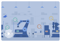
Smart Assistants
Guide clear action and boost engagement by tapping into frontline insights
Your frontline teams are the eyes and ears of your shop floor. They can provide important context about why downtime is happening that machines can’t. Human context is the key to uncovering the root cause of production losses and guiding more effective actions to resolve bottlenecks.
Learn More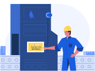
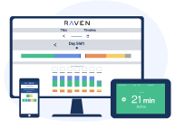
Make downtime tagging easy with intuitive HMIs
Raven’s Operator Smart Assistants are designed for the way the frontline works. HMIs conveniently placed on your lines engage operators to tag downtime with the touch of a button. Operators are only prompted to add tags when machines don’t have the answers.
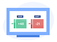
Boost awareness and productivity on the shop floor
Gamification and end-of-line dashboards bring awareness and recognition to the shop floor by showing teams whether they’re winning or losing each shift. Real-time visibility into metrics the frontline can control focuses them on hitting targets.
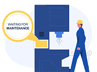
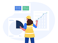
Take action using real-time insights and alerts
Raven’s Supervisor Smart Assistants allow managers to easily monitor the current status of all machines from anywhere. Instant alerts empower them to resolve issues as soon as they arise.
Reporting Platform
Make confident, fact-driven shop floor improvements with production monitoring software
Raven is the only solution that combines machine data and frontline insights to provide a complete timeline of production events – with context for every second.
Learn More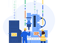
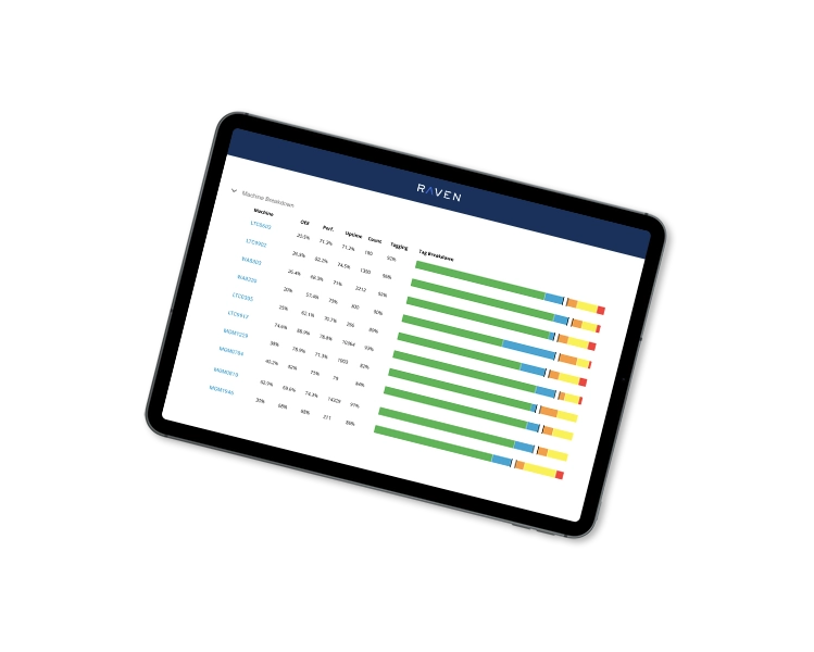
Accurately account for 100% of production time
Pull data from your existing machines to automatically tag downtime and create a timeline of production events. Fill in missing data with real-time context from your frontline to create a complete, accurate account of losses.
Uncover top losses and improvement opportunities
Raven’s Top Losses and Opportunities and Pareto Reports highlight where efforts should be focused and what actions are needed to sustainably reduce downtime, boost productivity and maximize ROI.
Align teams with a digital, single source of truth
Replace error-prone whiteboards and spreadsheets with automated, fully-digitized reporting that aligns teams on a single source of truth.
Raven Success Stories
- Better Changeovers
- Downtime Reduction
- Hidden Capacity
Eliminate bottlenecks.
Get started with Raven.
Book a Demo
Raven Success Stories